The point of sale is a dog-eat-dog world. Inside a store, competition is as pervasive as Google and as cut-throat as a season finale on Game of Thrones. If your product is not displayed in the right way, it will be eclipsed by the glitz and glamour of its neighbours. And appealing to shoppers is difficult enough as it is. Boredom or stress can turn them into impatient collectors, who quickly run out of steam unless they see something that excites them.
In light of this, many brands need not only to develop better packaging, but also to find a way of setting the emotional scene for their products. The store of the future is a stage, and the only actors performing on it will be those who have a visual story to tell and some kind of entertainment to offer.
A good story and effective room design can generate new audiences and loyal fans and followers. If both these things are lacking, the expert helps to construct a striking brand environment in which packaging and store design go hand in hand. Innovative shelves, displays and animated screens or stands create interaction between shoppers and merchandise, embedding products in a visual experience. And who doesn't like a bit of OOH, AAH and WOW when they’re shopping?
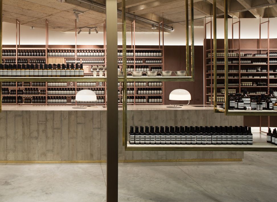
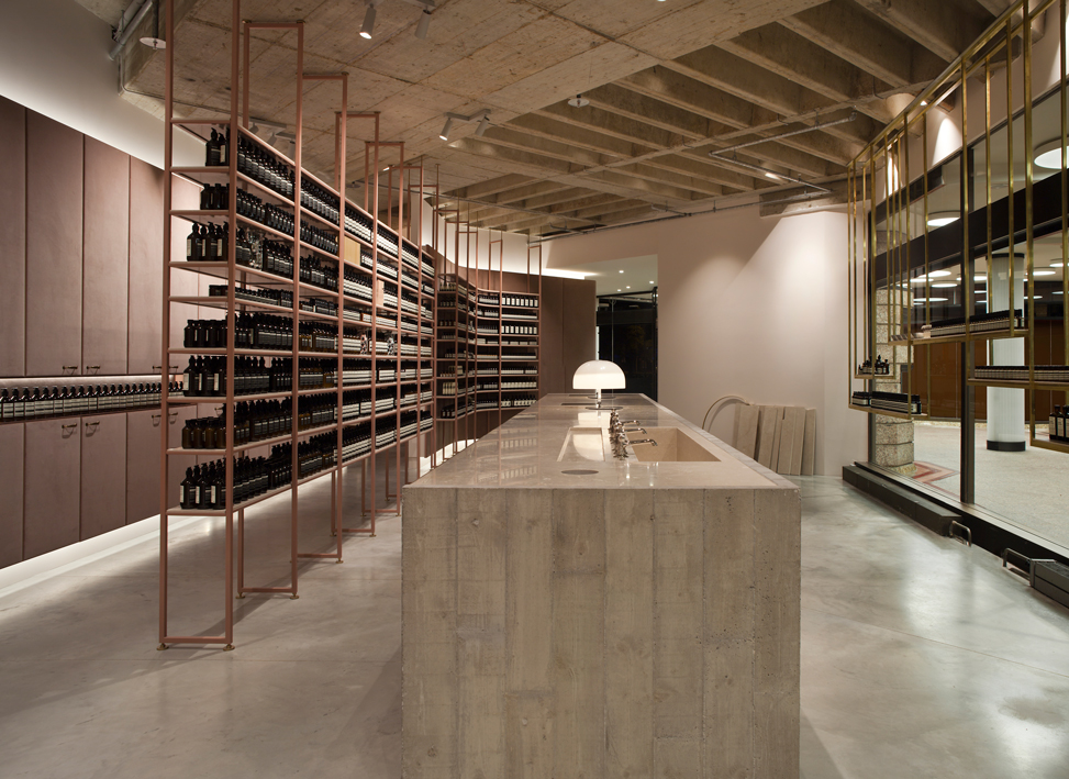
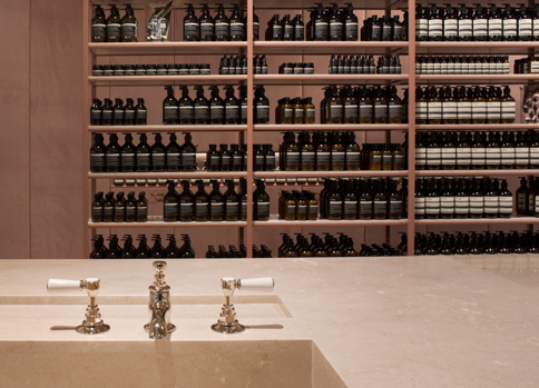
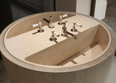
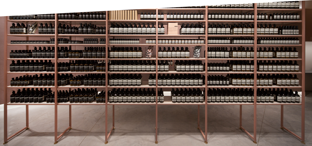
Aesop flagship stores
Individual concepts for every room
Aesop never fails to provide the 'wow effect'. This Australian cosmetics brand now has a number of signature stores across the globe, each more impressive than the last – a coherent concept that encompasses not only packaging design but also the architecture of the room. The latter is tailored to suit both the brand philosophy and the characteristics of the individual space – a sophisticated design concept which places the customer, and a relaxed shopping experience, centre-stage.


