Rules are meant to be broken: This year’s Packaging Impact Award (PIDA) 2014 in Stuttgart was all about ‘Breaking the Code’ to challenge the traditional champagne packaging (not bottle) and create a contemporary package preferably with a futuristic touch using BillerudKorsnäs premium packaging material.
PIDA is the name of the Packaging Award that is hosted each year in April by the Swedish company BillerudKorsnäs at the ‘Hochschule der Medien’ in Stuttgart. It is a great event that allows German students showcase their technical, conceptional and artistic gift. This year’s brief was all about Champagne.
En détail
Champagne stands for tradition, glamour and ultimate luxury. It is a drink with which you can celebrate and relax (apparently Marylin Monroe took frequent Champagne beauty baths), yet there is one thing Champagne is not particularly good at: Attracting young target groups with different consumer habits. With the 10th anniversary of PIDA, the classy Champagne package was supposed to transform into a trendy product, without losing its former mystic appeal. The designs were assessed with respect to the following criteria: First, ‘Best Innovation/ Concept’, meaning that good packaging design is based on a successful marketing concept; second, ‘Best Shelf Impact’, and third, ‘Best Challenger of the Brief’.

The winners
Best Innovation/ Concept
Among the winners is ‘Champagne en blanc’, a package for true romantics designed by Julia Kugel and Lukas Rublinger. The team had chosen the French national symbol as the shape of their package. Its cap can be removed and replaced by a candle highlighting the image of a glowing Eiffel Tower. Two candles are already part of the inlay and are placed to the right and left hand side of the bottle – a simple idea with a great effect.
Best Shelf Impact
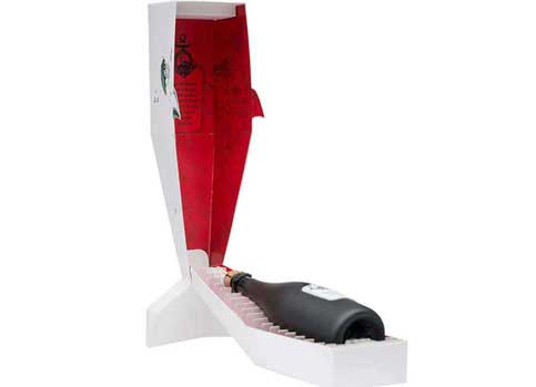
Obviously, the design of ‘Capt’n Ahab’ is based on the images and stories of Moby Dick, an idea of Michael Bauer, Florian Beck and Moritz Brodmann. Their carton box is shaped like a whale and can be placed either vertically or horizontally. The package incorporates a rope yarn and a tag with the logo. Once you open the box, you are able to see the ‘bloody’ inside of the whale where the Champagne bottle is securely fastened to the skeleton – a true eye catcher in the shelf.
Best Challenger of the Brief
Last, but not least, Marcel Messner could win over the jury and audience with his user-friendly sixpack for Champagne called ‘Champunker’. The rebel among the designs was able to break the code and target a new and specific consumer group. The skull that is illustrated on the carton box fuses with the handles that come in the shape of Mohawk haircut. Typography and colour scheme create a convincing unit.
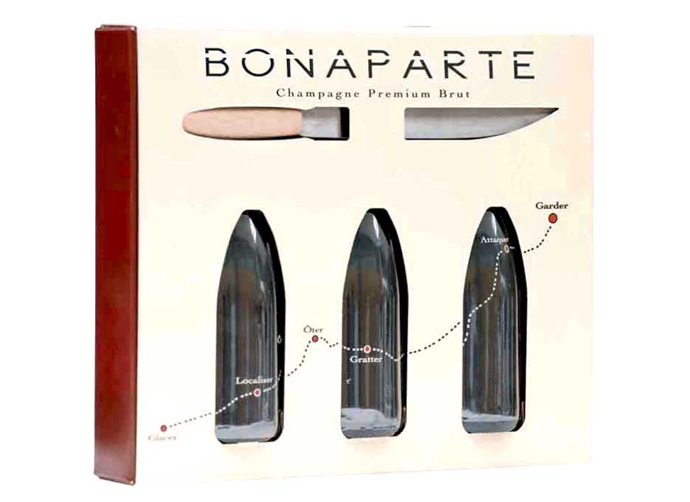
However, not only the winner projects presented smart ideas. The design ‘Bonaparte’ literally broke the code by including a sabre that is able to break the bottle. Other groups created a package with a cooling system or introduced a ‘Champagne to go’ endowed with straws and a disposable camera to capture the nice moments during travel, while others developed a sculpture package for art lovers.
The successful design competition was accompanied with a series of lectures that highlighted, among others, ‘The future of packaging’ and definitely provided enough inspiration for next year’s event.
