Chocolate is delicious. Addictive. And now beautiful too.
Chocolate lovers used to be divided into two camps – Milka versus Ritter Sport – but now there's a whole host of brands, philosophies and flavours to tempt the tastebuds of those with a sweet tooth. With varieties from raspberry cream to almond butter to goat's milk, chocolate-making knows no bounds – and happily, the possibilities when it comes to packaging design are just as limitless. Which one is your favourite?
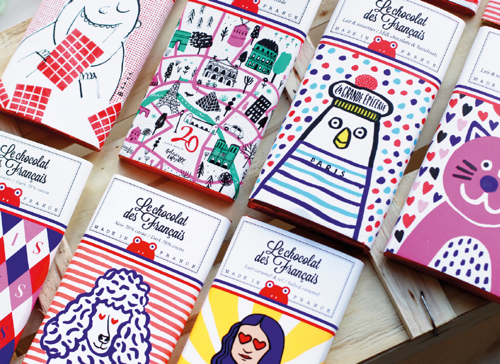
1. Le Chocolat des Français – very French charm
Le Chocolat des Français produces hand-made chocolate using 100% pure cacao butter and no palm oil. The mannequin underneath the tablette de chocolat creates an interesting optical effect by using the packaging surface as a canvas for distinctive, brightly coloured illustrations. Broad brush strokes, perfect imperfection, charming chic, and voilà – the seduction is complete. And beneath the bold designs of the sleeve is the gleam of delicate copper-coloured foil. Très bien!

2. Willie’s Cacao – a world full of adventure
Its square shape makes Willie's Cacao the perfect provender for an outing in the countryside. The packaging has an air of wanderlust about it, and the sleeve colours reflect the true hero of this very special delicacy: the cacao bean. Different flavours feature variations on the vintage packaging design and typography. The folding box opens to reveal a slab of pure chocolate gold.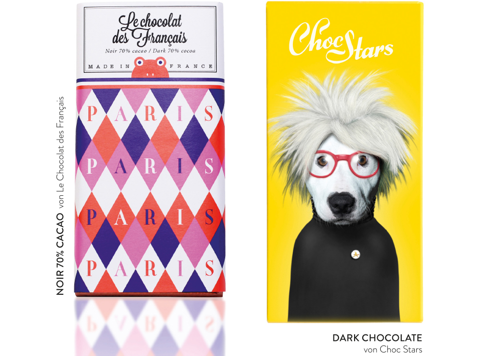
3. Celebrity style with ChocStars
Chocolate with a sense of humour – ChocStars bars feature portraits of celebrities on their packaging. But these are no ordinary celebrities – these are cats and dogs bearing uncanny resemblances to famous people from Snoop Dogg to Lady Gaga, from Andy Warhol to Karl Lagerfeld. The eccentricity of the packaging adds a fun, lively touch to any chocolate shop and makes ChocStars a very popular gift. On the back of the packaging is a label printed with the message: From... To...!
4. A must-try – Chocolatetexture by nendo
Although Japanese design studio nendo specialises in surfaces, it is not only interested in the externals. Instead, the structural design of the chocolate serves to create a unique and enhanced taste experience. Each individual piece of chocolate has its own texture and haptic qualities, making for an extraordinarily sensual taste experience. A brilliant idea, made even more impactful by the understated packaging design.
5. Chocolate meets wallpaper & paint
This year's chocolate collection from the New York-based Mast brothers combines abstract geometric shapes and textures with an extraordinary colour palette. The emotive paintings – inspired by American and Italian sculptors and architects of the 1970s and '80s – are imbued with lightness and movement. Which is perhaps why these tempting treats find it so easy to work their way into our shopping baskets. The bars now come in three different sizes for small, medium and large chocolate cravings.


