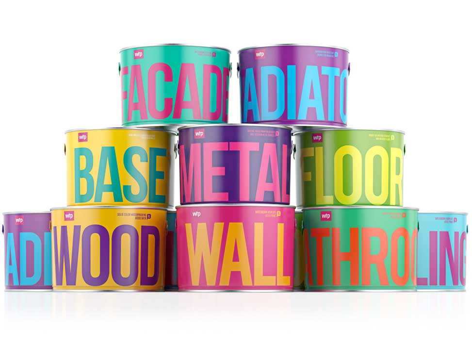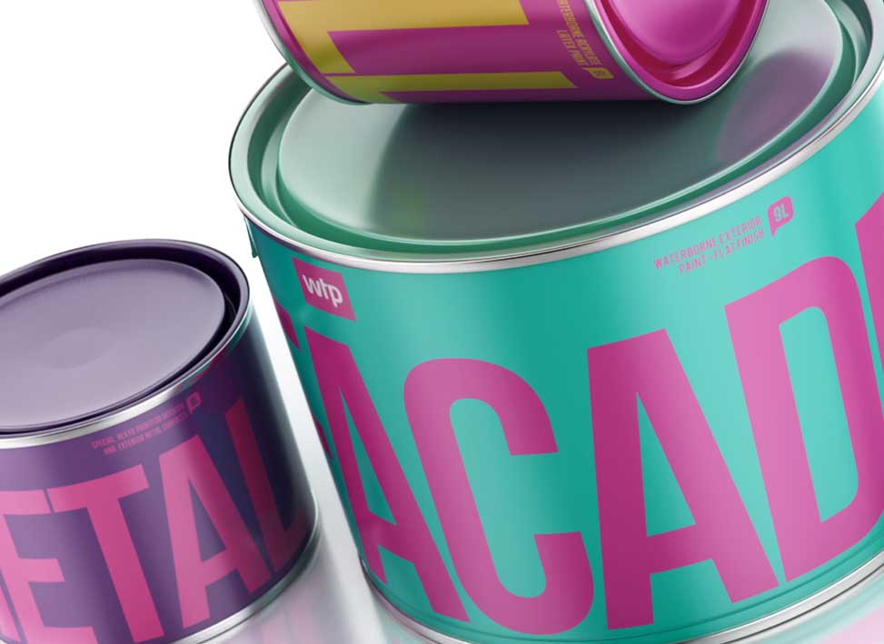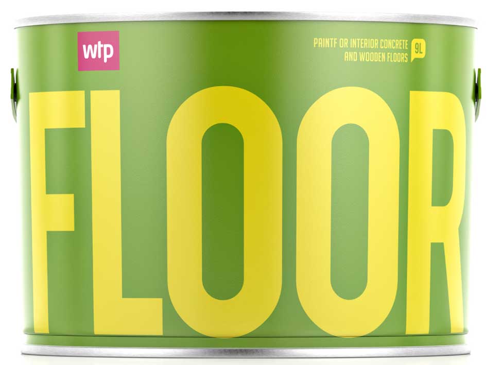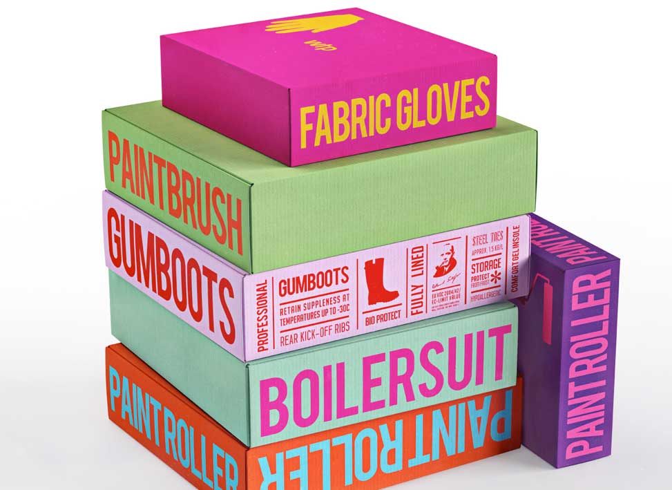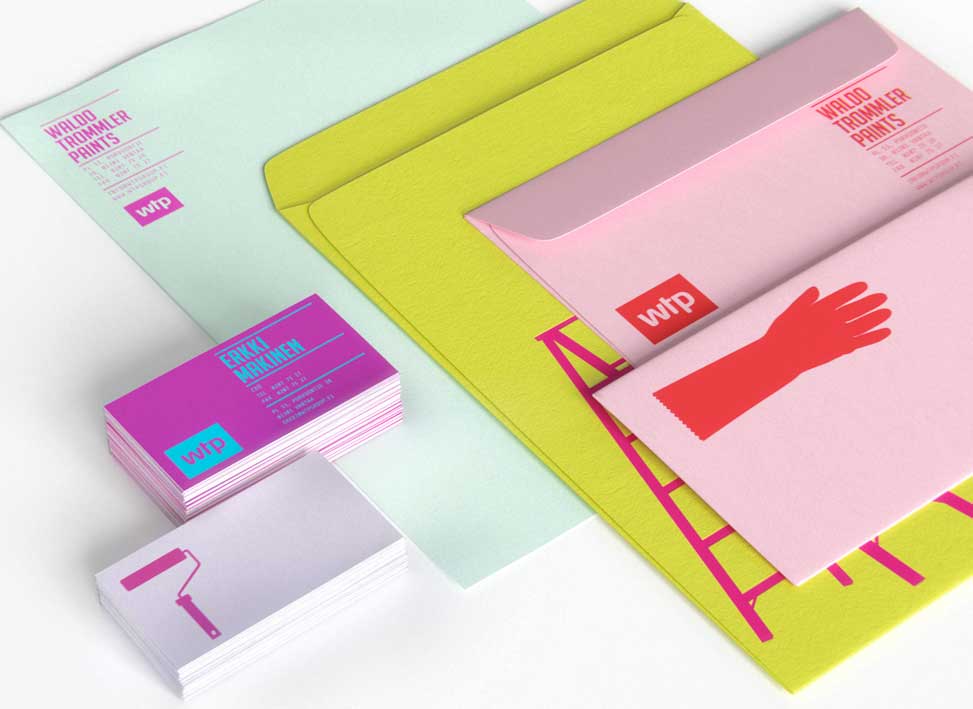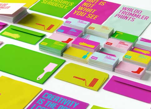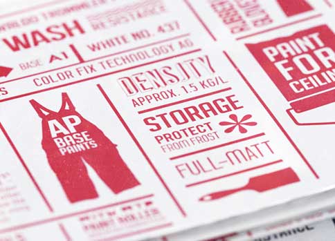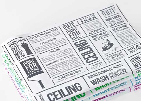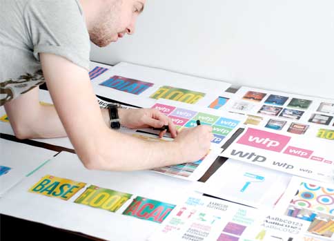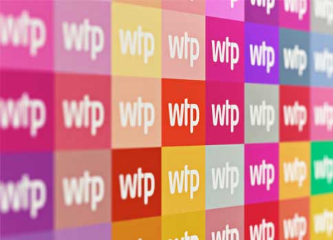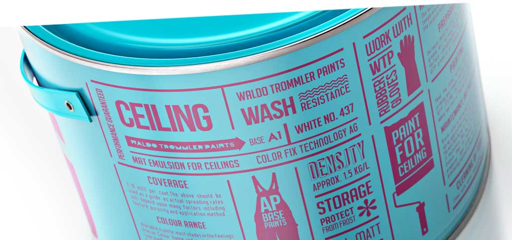

Sometimes less is more. And sometimes more is more. Focusing on little information on front of the packaging and on many different bright and bold colours, Reynolds & Reyner combined both mottos when it comes to their outstanding design for Waldo Trommler Paint.
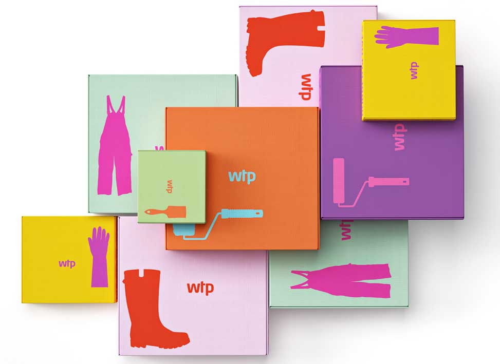
The Finnish newcomer paint company knew it had to focus on its packaging design to create an immediate impact. “We must stand out!” became the basis of the work and was implemented through the strong use of colours and font. Big and simple lettering on front of the tins made pretty clear, where to apply the product. More information was applied to the backside with the helpf of neat infographics. Icons and descriptive titles run through the entire product line – ranging from paint rollers to boilersuits.
+
PACKAGING DETAILS
PACKAGING MATERIAL: Tinplates and Boxes
LAYOUT: A combination of bold titles and colours. Interestingly enough there are no CI colours, rather each product receives its own colour resulting in a mosaic of colours which stand for a friendly and stylish approach
