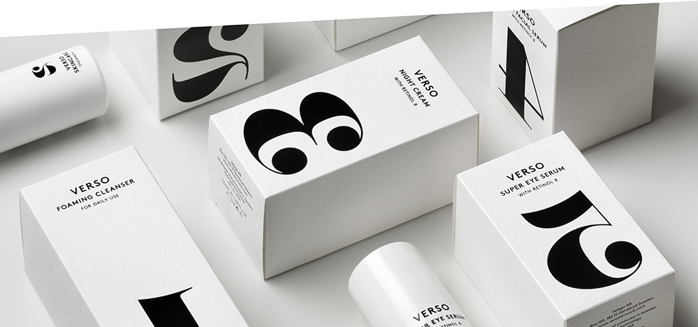
Verso works differently and hence looks much better - Verso Skincare by Tomorrow Studio, Sweden.
"Verso is latin and means reverse, as in the backside of a painting or the back view of a dress. It is what is normally hidden underneath, the mirrored view. In a metaphorical sense, you could say it means going your own way, being different. And Verso is a very different kind of skincare. It has a unique and patented formula called Retinol 8 that helps the skin cells to mimic how young cells behave, effectively reversing the signs of aging."
Likewise, the packaging takes another path. It aims to have an easy and simple attitude. In a very hectic world it is important to leave out unncessary information that only complicates the product. So Verso is focused and incorporates an smooth black and white look. According to its name and function the numbers are reversed and show that difference really makes a difference.


+
PACKAGING DETAILS
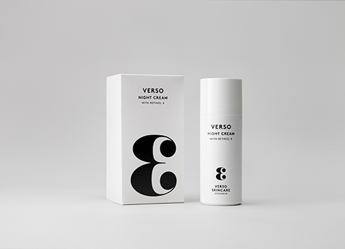
PACKAGING & MATERIAL: Cylindrical plastic bottles with dispenser, folding box with Hahnemühle watercolour paper
LAYOUT: The typography and the mirror-inverted numbers are a true eyecatcher, the black and white colouring is modern and classy at the same time


