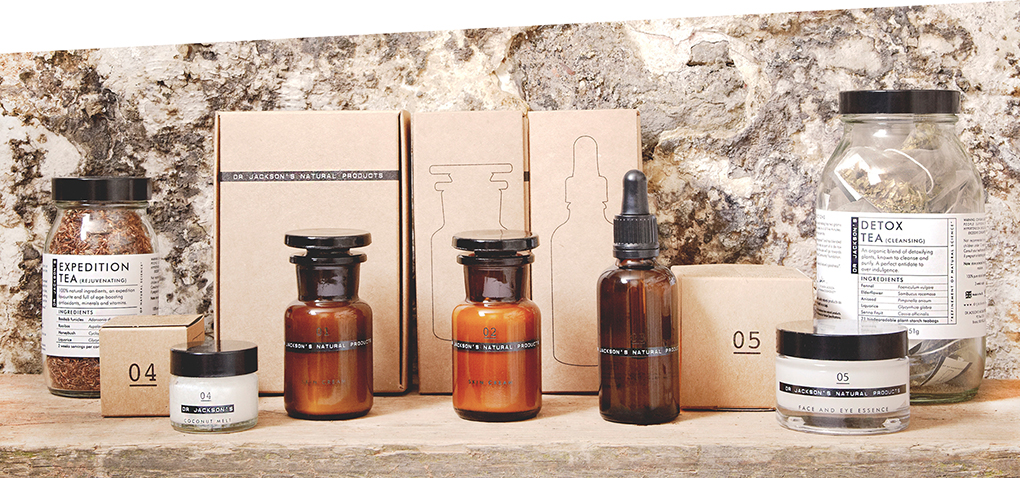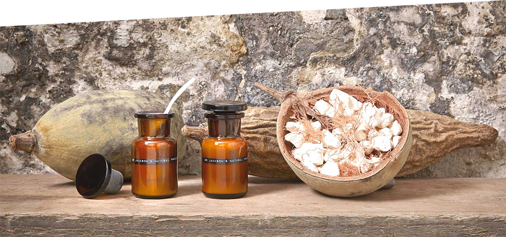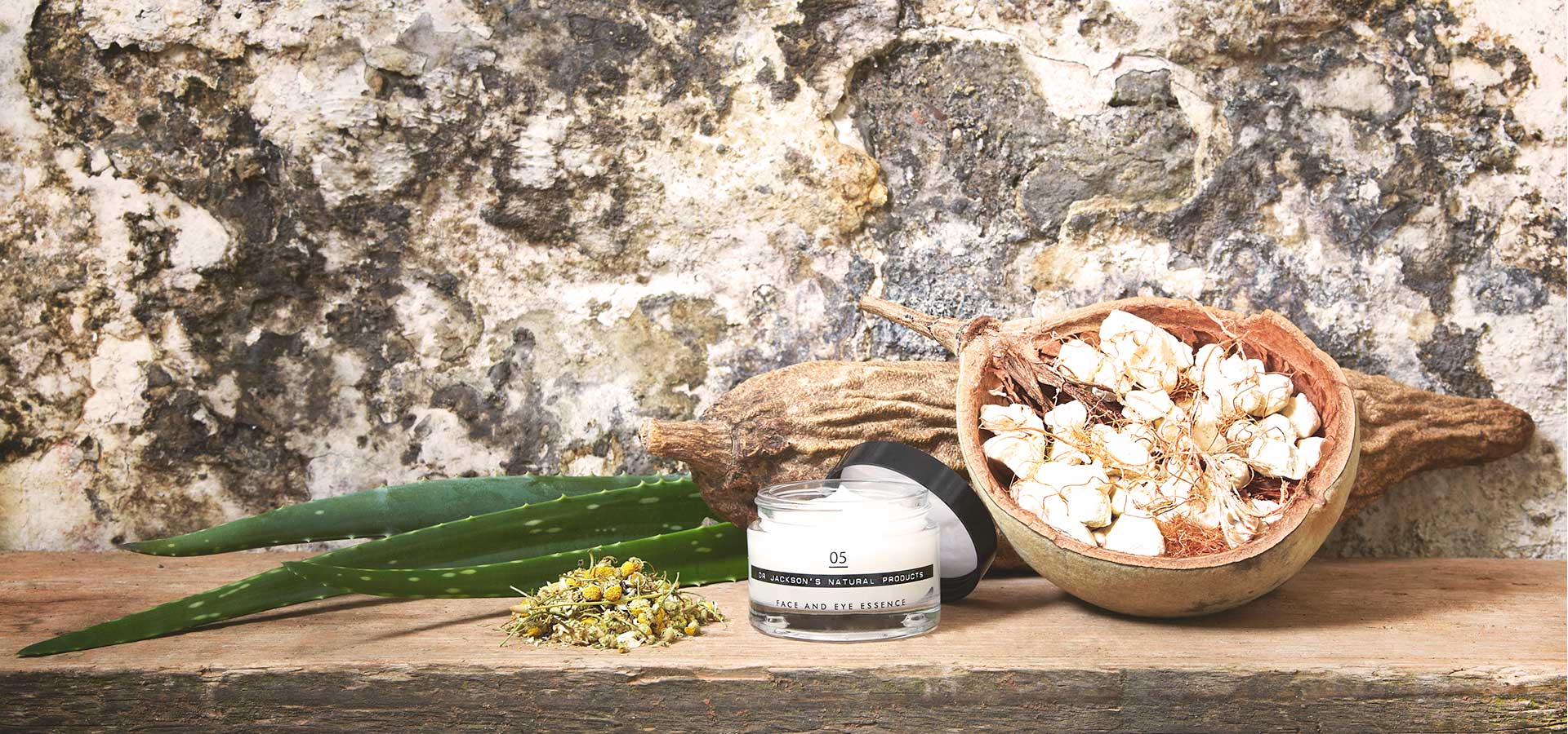
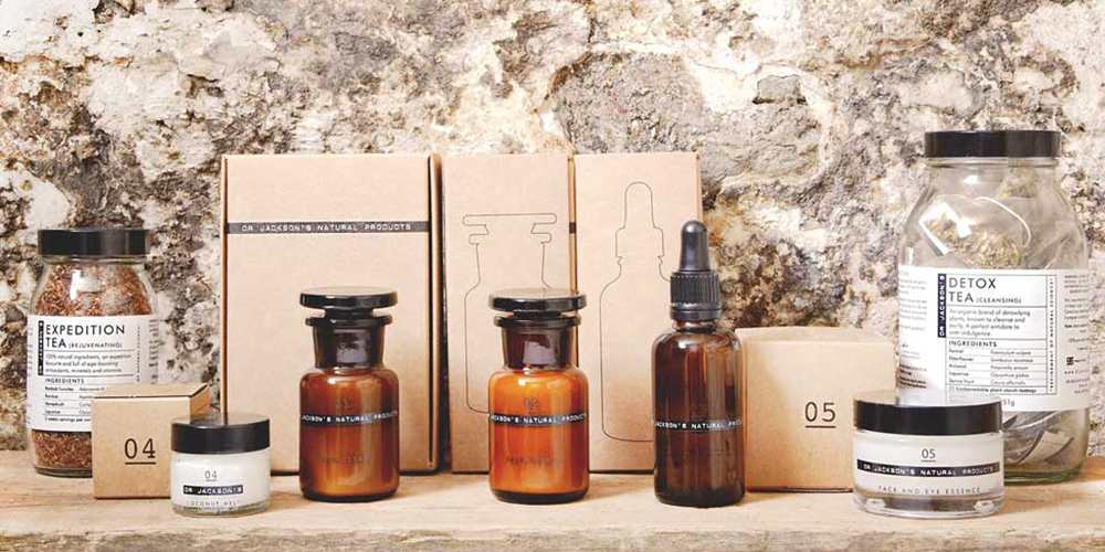
What sounds like a new American series about hot doctors is in truth a natural cosmetic range from England, yet possibly with the same addictiveness. Second truth is, there couldn’t be a better packaging to present the idea of pharmacognosy. Dr Jackson’s understands itself as ethical brand setting focus on medicines derived from natural sources and successfully supports his philosophy through a well-chosen visual.
No doubt, East London is able to inspire, especially when you decide to spend the time with the creative scene in town and begin to collaborate with fashion personalities. Moreover, Dr. Jackson did his PhD at Kings College, University of London, specialising in African medicinal plants.

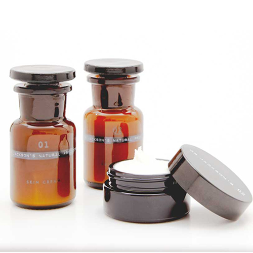
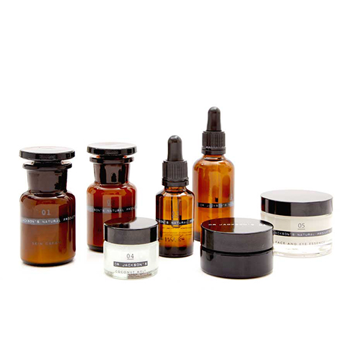
His competence and design understanding is reflected in the packaging. The dark coloured pharmacy bottles communicate nostalgia and medical expertise. The entire natural product range creates a coherent look as it is complemented by black & see-through jars and a pipette. The colour code emphasises the fact that all ingredients are won from an African medicinal plant.
What more can we say? We don’t even want to pretend to resist.
+
PACKAGING DETAILS
PACKAGING & MATERIAL: brown glass bottle, glass jar, labelled plastic wide neck bottle, folding box
RINTING METHOD & FINISHING: Bottle is printed directly and carries a typewriter typeface, the brown colour works as UV-barrier
LAYOUT: Nostalgic, but minimal apothecary theme


