With these bold labels, even water looks quite noble – the story of Aqua Monaco.
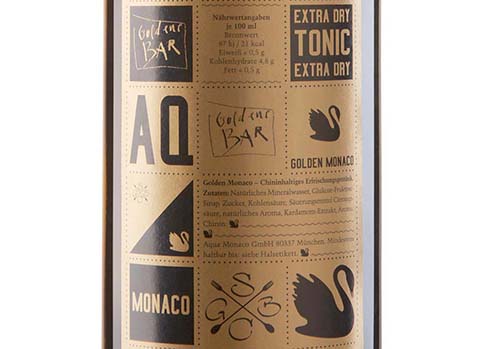
Currently, Aqua Monaco captures the Munich beverage market and, without a doubt, there is a reason why. Few label designs are as complex, yet straightforward as the one of the Munich brand. The grid on the front of each product perfectly matches the charming curves of the bottle. A good mix of different typographies and graphical elements create, on the one hand, symmetry and order, and on the other hand, a playful ease. Clean, yet catchy.
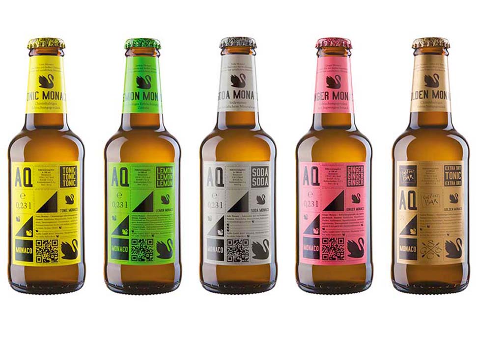
It’s the passion for detail that makes the range appear confident and it’s the name that underlines the brand’s values: Aqua Monaco refers to ‘Monaco di Baviera’, the Italian name for the Bavarian state capital. No surprise, a noble swan had to be the trademark of all products.
Product Details – Mixer:
The filler range is characterised by its unique label design
Strong colours of the paper label mark the rich taste of the products
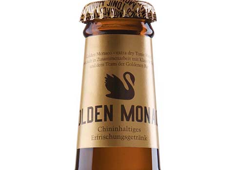
Detail: The brand name is part of the crown cork too, as it repeats itself, it creates a great visual effect
+
PACKAGING DETAILS
PACKAGING & MATERIAL: 0.33l labelled glass bottles with paper label, 0.75l water bottles without label
PRINTING METHOD & FINISHING: Offset print, logo on crown cap and in colour of the flavour
LAYOUT: The swan as returning motiv combined with geometrical elements


