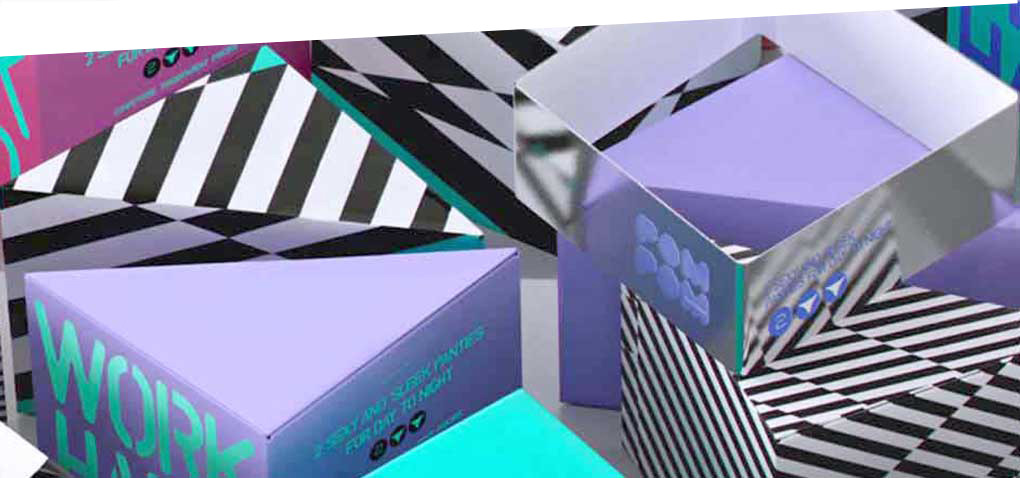
Recently, we feel like we are constantly confronted with 90s funky computer trash themes and it really makes us chuckle. It reminds us of a our childhood where PacMan was still chasing something that looked like little polka dots and when Larry Lover, the old charmer, was trying to woo as many ladies as possible (dare you say you don’t know this game).
Truth is, lay it on thick was the motto then so there was too much colour and literally too much edge everywhere, yet it appeared to be the coolest thing ever.

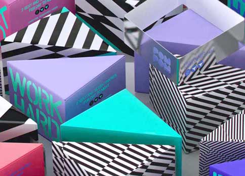
Just as expressive and charmingly over the top is the packaging from the new lingerie brand called POM POM created by Reynolds & Reyner agency for a fashion designer from Los Angeles.
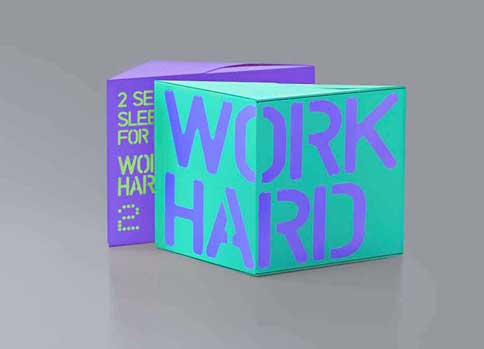
The 2-piece set is read not only in the brand name and the brand’s slogan “Work hard, play hard”, but also in the packaging. In each set there are two kinds of panties packed in individual boxes that resemble diagonally-cut cubes in shape. The first one is more comfortable and simple, for everyday use at work or fitness sessions, and the second box offers a more creative and interesting lingerie type for evenings and nights, parties and leisure.

+
PACKAGING DETAILS
PACKAGING & MATERIAL: Paper & Carton
PRINTING METHOD & FINISHING: Hot foil stamp, cut out logo on the business cards
LAYOUT: Geometrical elements and patterns, illuminating colours


