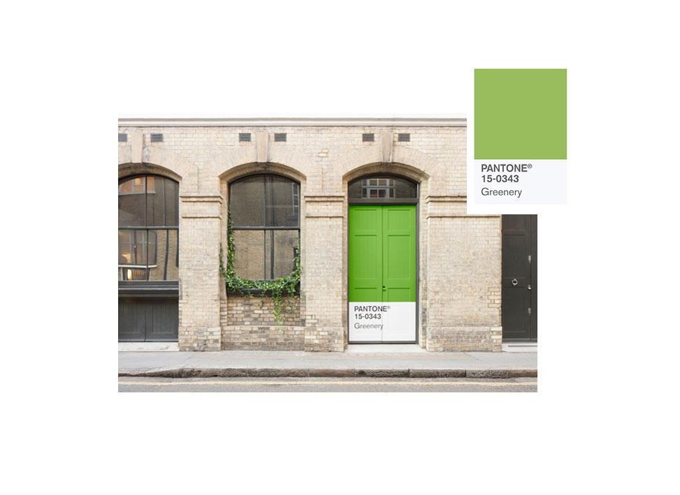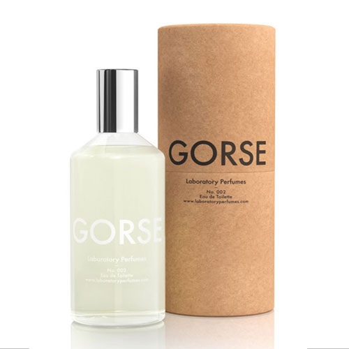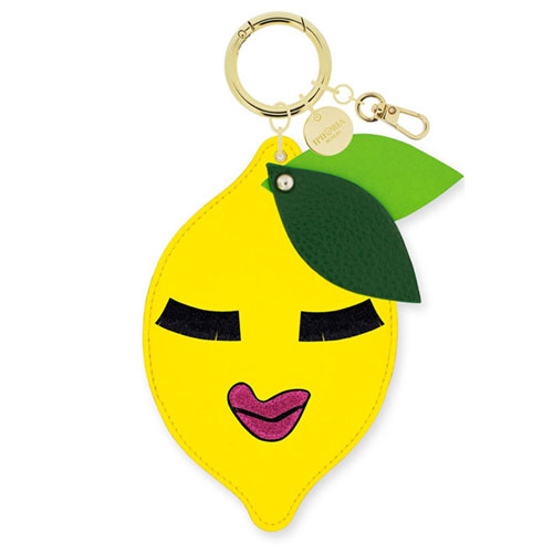
It’s about time. We need a colour of hope, a colour of inspiration: Apparently, a fresh and zesty yellow-green, a true spring colour marking new beginnings as Pantone has set the watches to recovery mode.
2017 will be the year of greens, not only because spring is approaching (hopefully soon), but also because the known Colour Institute Pantone has selected the new hue of 2017. A vibrant Greenery stands for the reinvention of oneself in tumultuous times and the desire to take a deep breath, to rejuvenate and recover.
Frankly, the philosophy behind the colour is beautiul, but how does the tone feel outside its natural biotope, growing inside our own four walls?
The trend forecasters gave it a try. To fully live the colour, Pantone had teamed up with AirBnB to launch the “Outside In house in London. From January 27 – 30 travelers could realx in a world of Greenery, including an indoor greenhouse, a garden bedroom with mown lawn, topiaries and soporific plants, a tented nook in the greens to sleep in and a herb garden kitchen. A lush oasis within a brick walled house – all so natural, Greenery embraces the reconnection we seek with nature and also mirrors in many home & living magazines as their collections turn into a lush green.
As highlighted in the 2016 collections by known fashion labels, such as Kenzo and Gucci Greenery can set a comforting contrast in the light of the artificial. On the runway, the powerful green came to life in combination with proliferating prints and patches and flourishing flower stitching.
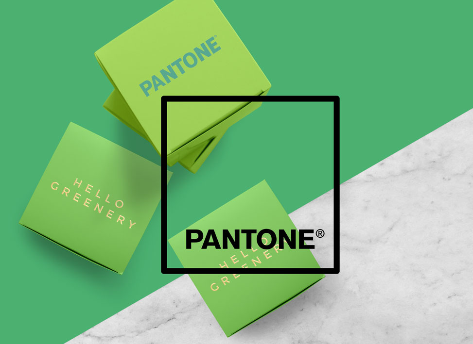
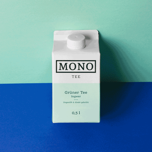
However, outside the world of high fashion and in everyday life, the colour has to be used rather delicately, preferably with deeper shades and muted earthy tones. For special occasions Greenery can also shine in combination with metallic and brights. Lastly, it makes a perfect match with other shades of green. Teamed up with emerald and olive it just looks stunning, also in the world of furniture, design and packaging.
