")


Stripes, lines, reactangles, and stringent patterns… Geometry and graphical repetition is knocking us down these days even when it comes to packaging design.
I don’t really appreciate compass and numbers, yet graphics that follow the rules of geometry happen to be very fascinating. They appear very pleasing and calm through their repetitive use, even when the pattern itself has a chaotic structure. Magazine covers and fashion items have already discovered the benefits of geometry and now it’s about time to update the packaging.
Get in touch with these three brands that already adapt the style on their packaging:
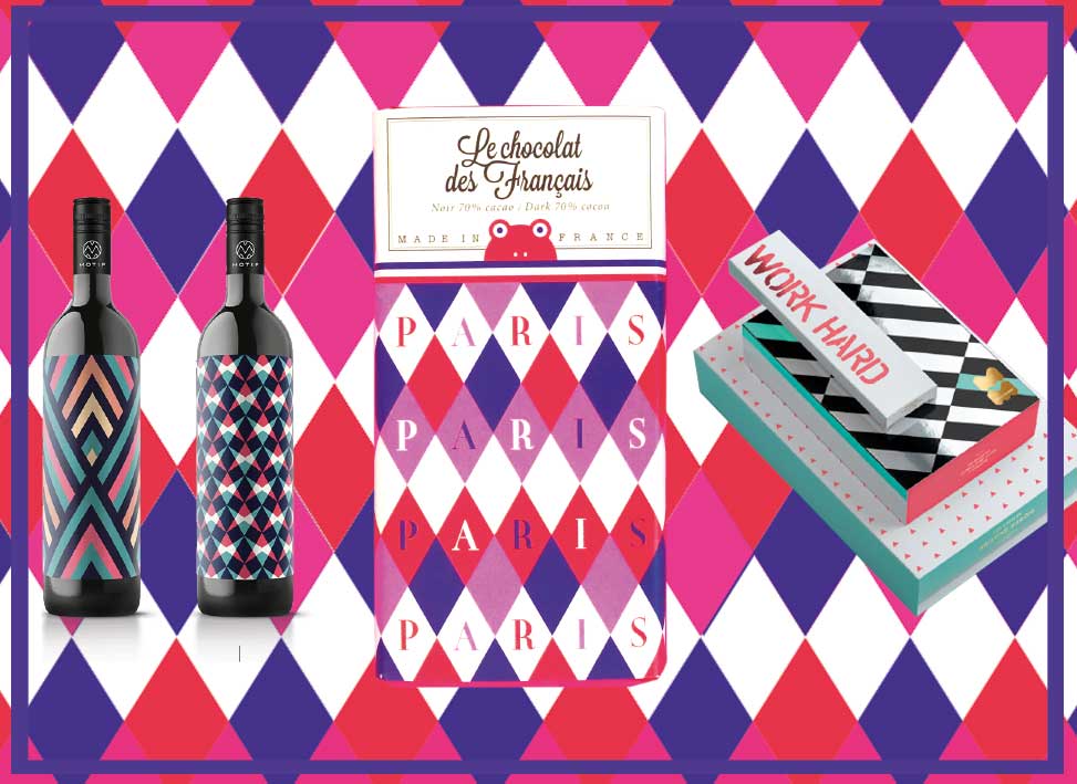
Motif Wine: For six different flavours EN GARDE developed six outstanding geometry-inspired designs to visually capture the flavourable and olfactory vibrancy of the wine. Who would want to deny a bottle like that?
Le Chocolat des Francais picks up on the pattern trend and makes it look quite easy. The structure is loosened through its jazzy colours which is why the packaging is fashionably traditional.
POM POM: The lingerie brand from Los Angeles, designed by the studio Reynolds & Reyner, reminds us of trashy colours and the PacMan craze of the 90s. How could we ever forget about the joy of these times? Find out more about POM POM in this article.